No doubt you interact with at least one form on the Web every day. Whether you’re searching for content or logging in to your e-mail account or Facebook page, using online forms is one of the most common tasks performed on the Web. As designers and developers, creating forms has a certain monotony about it, particularly writing validation scripts for them. HTML5 introduces a number of new attributes, input types, and other elements for your markup toolkit. In this article we’ll be focussing on the new attributes with a future article looking at the new input types.
As we’ll see, these new features will go a long way toward making your life easier while delivering a delightful user experience. The best thing about all this? You can start using them now. We’ll start with a (very) brief history of HTML5 forms though.
This is article is an excerpt from Chapter 6 of Beginning HTML5 and CSS3: The Web Evolved by Christopher Murphy, Oli Studholme, Richard Clark and Divya Manian, published by Apress.
Note: As this article is a book excerpt, browser renderings of attributes and input types may have altered since the screenshots were taken. Additionally, browser support may have increased since publication so please refer to the links at the end of the article for the current state of browser support.
A history of HTML5 forms
The forms section of HTML5 was originally a specification titled Web Forms 2.0 that added new types of controls for forms. Started by Opera and edited by then-Opera employee Ian Hickson, it was submitted to the W3C in early 2005. The work was initially carried out under the W3C. It was then combined with the Web Applications 1.0 specification to create the basis of the breakaway Web Hypertext Application Technology Working Group (WHATWG) HTML5 specification.
Using HTML5 design principles
One of the best things about HTML5 forms is that you can use almost all of these new input types and attributes right now. They don’t even need any shivs, hacks, or workarounds. That isn’t to say they’re all “supported” right now, but they do cool things in modern browsers that do support them-and degrade gracefully in browsers that don’t understand them. This is thanks to HTML5′s design principles. In this instance we’re specifically referring to the principle of graceful degradation. In essence, this means that there’s no excuse for not using these features right now. In fact, it means you’re ahead of the curve.
HTML5 form attributes
There are 14 new attributes that we’ll be looking at in this article.
placeholderautofocusautocompleterequiredpatternlistmultiplenovalidateformnovalidateformformactionformenctypeformmethodformtarget
placeholder
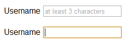
First up is the placeholder attribute, which allows us to set placeholder text as we would currently do in HTML4 with the value attribute. It should only be used for short descriptions. For anything longer, use the title attribute. The difference from HTML4 is that the text is only displayed when the field is empty and hasn’t received focus. Once the field receives focus (e.g., you click or tab to the field), and you begin to type, the text simply disappears. It’s very similar to the search box you see in Safari (see Figure 1).

Let’s have a look at how to implement the placeholder attribute.
<input type="text" name="user-name" id="user-name" placeholder="at least 3 characters">That’s it! We can hear you thinking, “What’s so great about that? I’ve been doing it with JavaScript for years.” Yes, that’s true. However, with HTML5, it’s part of the browser, meaning less scripting is required for a more accessible, cross-browser solution (even when JavaScript is disabled). Figure 2 shows the placeholder attribute working in Chrome.
Browsers that don’t support the placeholder attribute ignore it, so it won’t render. By including it, though, you’re providing an enhanced user experience for those users who have browser support and you’re “future proofing” your site. All modern browsers support placeholder.
Note: There is no official pseudo-class for styling placeholder text but both Mozilla (makers of Firefox) and WebKit offer vendor prefixed properties for styling (-mozplaceholder and –webkit-input-placeholder). This makes it safe to assume that a pseudo-class will become standard for styling placeholder text. For further detail there is a thread on the WHATWG mailing list about this topic.
autofocus
autofocus does exactly what it says on the tin. Adding it to an input automatically focuses that field when the page is rendered. As with placeholder, autofocus is something that we used JavaScript for in the past.
Traditional JavaScript methods do, though, have some serious usability problems. For example, if a user begins completing the form before the script loads, they will (jarringly) be returned to the first form field when the script is loaded. The autofocus attribute in HTML5 gets around this issue by focusing as soon as the document loads, without having to wait for the JavaScript to be loaded. However, we only recommend using it for pages whose sole purpose is the form (like Google) to prevent the usability issues.
It is a Boolean attribute (except if you are writing XHTML5; see the note) and is implemented as follows:
<input type="text" name="first-name" id="first-name" autofocus>All modern browsers support the attribute and, like placeholder, browsers that don’t support the autofocus attribute simply ignore it.
Note: Several new HTML5 form attributes are Boolean attributes. This just means they’re set if they’re present and not set if they’re absent. They can be written several ways in HTML5.
autofocus autofocus="" autofocus="autofocus"However, if you are writing XHTML5, you have to use the autofocus="autofocus" style.
autocomplete
The autocomplete attribute helps users complete forms based on earlier input. The attribute has been around since IE5.5 but has finally been standardized as part of HTML5. The default state is set to on. This means that generally we won’t have to use it. However, if you want to insist that a form field be entered each time a form is completed (as opposed to the browser autofilling the field), you would implement it like so:
<input type="text" name="tracking-code" id="tracking-code" autocomplete="off">The autocomplete state on a field overrides any autocomplete state set on the containing form element.
required
The required attribute doesn’t need much introduction; like autofocus, it does exactly what you’d expect. By adding it to a form field, the browser requires the user to enter data into that field before submitting the form. This replaces the basic form validation currently implemented with JavaScript, making things a little more usable and saving us a little more development time. required is a Boolean attribute, like autofocus. Let’s see it in action.
<input type="text" id="given-name" name="given-name" required>required is currently implemented only in Opera 9.5+, Firefox 4+, Safari 5+, Internet Explorer 10 and Chrome 5+, so for the time being you need to continue writing a script to check that fields are completed on the client side in other browsers (*cough* IE!). Opera, Chrome, and Firefox show the user an error message (see Figure 3) upon form submission. In most browsers, the errors are then localized based on the declared language. Safari doesn’t show an error message on submit, but instead places focus on that field.

The default rendering of “required” error messages depends on the individual browser; at present the error message bubble can’t be styled with CSS in all browsers. Chrome, however, does have a proprietary property that you can use to style the error bubble. Peter Gasston has written an article about the syntax. You can also style the input using the :required pseudo-class. An alternative is to override the wording and styling using the setCustomValidity() method in JavaScript. Importantly, don’t forget that this browser validation is no substitute for validating on the server as well.
pattern
The pattern attribute is likely to get a lot of developers very excited (well, as excited as you can get about form attributes). It specifies a JavaScript regular expression for the field’s value to be checked against. pattern makes it easy for us to implement specific validation for product codes, invoice numbers, and so on. The possibilities for pattern are wide-ranging, and this is just one simple example using a product number.
<label>Product Number: <input pattern="[0-9][A-Z]{3}" name="product" type="text" title="Single digit followed by three uppercase letters."/> </label>This pattern prescribes that the product number should be a single digit [0-9] followed by three uppercase letters [A-Z]{3}. For more examples, the HTML5 Pattern website lists common regex style patterns to help get you started.
As with required, Opera 9.5+, Firefox 4+, Safari 5+, Internet Explorer 10 and Chrome 5+ are the only browsers with support for pattern at present. However, with the browser market moving at a fast pace, the others will soon catch up.
list and the datalist element
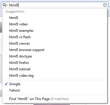
The list attribute enables the user to associate a list of options with a particular field. The value of the list attribute must be the same as the ID of a datalist element that resides in the same document. The datalist element is new in HTML5 and represents a predefined list of options for form controls. It works in a similar way to the in-browser search boxes that autocomplete as you type (see Figure 4).
The following example shows how list and datalist are combined (see Figure 5):
<label>Your favorite fruit: <datalist id="fruits"> <option value="Blackberry">Blackberry</option> <option value="Blackcurrant">Blackcurrant</option> <option value="Blueberry">Blueberry</option> <!-- … --> </datalist> If other, please specify: <input type="text" name="fruit" list="fruits"> </label>By adding a select element inside the datalist you can provide superior graceful degradation than by simply using an option element. This is an elegant markup pattern designed by Jeremy Keith that adheres perfectly with HTML5′s principle of degrading gracefully.
<label>Your favorite fruit: <datalist id="fruits"> <select name="fruits"> <option value="Blackberry">Blackberry</option> <option value="Blackcurrant">Blackcurrant</option> <option value="Blueberry">Blueberry</option> <!-- … --> </select> If other, please specify: </datalist> <input type="text" name="fruit" list="fruits"> </label>Browser support for list and datalist is currently limited to Opera 9.5+ (see Figure 5), Chrome 20+, Internet Explorer 10 and Firefox 4+.

multiple
We can take our lists and datalists one step further by applying the Boolean attribute multiple to allow more than one value to be entered from the datalist. Here is an example.
<label>Your favorite fruit: <datalist id="fruits"> <select name="fruits"> <option value="Blackberry">Blackberry</option> <option value="Blackcurrant">Blackcurrant</option> <option value="Blueberry">Blueberry</option> <!-- … --> </select> If other, please specify: </datalist> <input type="text" name="fruit" list="fruits" multiple> </label>multiple isn’t exclusively for use with datalists, though. A further example for multiple might be for email addresses when sending items to friend or the attachment of files, as shown here:
<label>Upload files: <input type="file" multiple name="upload"></label>multiple is supported in Firefox 3.6+, Safari 4+, Opera 11.5+, Internet Explorer 10 and Chrome 4+.
novalidate and formnovalidate
The novalidate and formnovalidate attributes indicate that the form shouldn’t be validated when submitted. They are both Boolean attributes. formnovalidate can be applied to submit or image input types. The novalidate attribute can be set only on the form element.
An example use case for the formnovalidate attribute could be on a “save draft” button, where the form has fields that are required for submitting the draft but aren’t required for saving the draft. novalidate would be used in cases where you don’t want to validate the form but do want to take advantage of the more useful user interface enhancements that the new input types offer.
The following example shows how to use formnovalidate:
<form action="process.php"> <label for="email">Email:</label> <input type="text" name="email" value="gordo@example.com"> <input type="submit" formnovalidate value="Submit"> </form>And this example shows how to use novalidate:
<form action="process.php" novalidate> <label for="email">Email:</label> <input type="text" name="email" value="gordo@example.com"> <input type="submit" value="Submit"> </form>form
The form attribute is used to associate an input, select, or textarea element with a form (known as its form owner). Using form means that the element doesn’t need to be a child of the associated form and can be moved away from it in the source. The primary use case for this is that input buttons that are placed within tables can now be associated with a form.
<input type="button" name="sort-l-h" form="sort">formaction, formenctype, formmethod, and formtarget
The formaction, formenctype, formmethod, and formtarget attributes each have a corresponding attribute on the form element, which you’ll be familiar with from HTML4, so let’s run through each of them briefly. These new attributes have been introduced primarily because you may require alternative actions for different submit buttons, as opposed to having several forms in a document.
formaction
formaction specifies the file or application that will submit the form. It has the same effect as the action attribute on the form element and can only be used with a submit or image button (type="submit" or type="image"). When the form is submitted, the browser first checks for a formaction attribute; if that isn’t present, it proceeds to look for an action attribute on the form.
<input type="submit" value="Submit" formaction="process.php">formenctype
formenctype details how the form data is encoded with the POST method type. It has the same effect as the enctype attribute on the form element and can only be used with a submit or image button (type="submit" or type="image"). The default value if not included is application/x-www-formurlencoded.
<input type="submit" value="Submit" formenctype="application/x-www-form-urlencoded">formmethod
formmethod specifies which HTTP method (GET, POST, PUT, DELETE) will be used to submit the form data. It has the same effect as the method attribute on the form element and can only be used with a submit or image button (type="submit" or type="image").
<input type="submit" value="Submit" formmethod="POST">formtarget
formtarget specifies the target window for the form results. It has the same effect as the target attribute on the form element and can only be used with a submit or image button (type="submit" or type="image").
<input type="submit" value="Submit" formtarget="_self">Form attributes summary
We’ve looked at several new form attributes that help improve user experience and save you development time. There are some more new attributes to discuss, which are covered together with HTML5′s new input types in the next article in this series.
You can find a dummy form, using some of the examples we’ve shown in this article at our HTML5 forms demo page.
We’ve hinted throughout the article at which browsers have support for HTML5 forms input types and attributes. With new versions of browsers being released at an ever-increasing rate, it can be difficult to keep up with what is or isn’t supported. If you want to keep an eye on the current progress, we suggest visiting When can I use … or FindMeByIP or Wufoo’s HTML5 forms research.
This is article is an excerpt from Chapter 6 of Beginning HTML5 and CSS3: The Web Evolved by Christopher Murphy, Oli Studholme, Richard Clark and Divya Manian, published by Apress.
HTML5 forms introduction and new attributes originally appeared on HTML5 Doctor on February 26, 2013.
[plinker]